Using the DIALOG logo
There are a few things we’re really sticky on—the logo is absolutely one of them. It shouldn’t be modified in any way and must always include the registered trademark symbol (®).
Our Logo
Our logo is the strongest visual identifier we have. It embodies the true essence of DIALOG. The concept uses two mirrored speech bubbles within the letterforms to represent open conversation between DIALOG, our clients, and our communities.
There are a few things we’re really sticky on—the logo is absolutely one of them. It shouldn’t be modified in any way and must always include the registered trademark symbol (®).
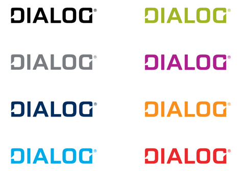
The logo is available in DIALOG’s seven brand colours, black, and white. Please select a logo colour that will visually differentiate itself. For example, if the DIALOG logo is being used in a sponsorship logo garden where most sponsors have blue logos, select orange, red, or magenta to stand out.

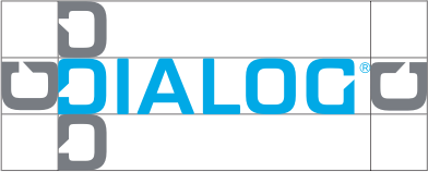
Please make sure there’s sufficient clear space around the logo for the most impact. The clear space should be equal to the height of the D in DIALOG.

The logo shouldn’t be modified in any way and must always include the registered trademark symbol (®).

The minimum size for all print applications is 0.75″ in width.
