News & Events
Insights

2018 Iris Prize recipients explore the wonder world of our underworld

November 28, 2019

When most of us think of underground public transit stations, we think of utilitarian, mundane and sterile places regarding both user experience and design. They are something to be endured, not enjoyed.  When Mahsa Shobbar and Sabrina Hoeck look at subway stations, they see potential. The potential for a wonderful experience through the underground: A “Wonder World.”

That inspiration is what led the pair of Intern Architects at DIALOG to the 2018 Iris Prize, an annual competition that allows company employees two weeks of paid time off and a $7500 budget to research an area of personal interest, relevant to the practice of architecture, engineering, interior design, planning, urban design or landscape architecture.

“Sabrina and I got to thinking, we don’t really have a sense of arriving to a specific station by train in Vancouver’s current underground stations. If you aren’t aligned to the signage or missed the audio cue due to the natural commuter chaos, you are unaware of which stop you are at.” – Mahsa

Vancouver, where both Hoeck and Shobbar live and work, is currently in the process of planning an extension of their existing train system that will eventually connect the city from east to west. The project will include six new underground stations. As ideas often do, it sparked another: How do we design underground transit spaces where the user can find way with ease, feel safe and identify within the city?

Like many places in North America, Vancouver puts a lot of its design focus on its above-ground infrastructure, the design and user experience of underground stations is often neglected.  So where do a pair of aspiring architects turn for inspiration?

“Through our online research we found many stations throughout Europe were underground stations are designed in a very inviting, tasteful and often exciting way. We decided that we wanted to visit cities and subway systems which would be comparable to the Vancouver network and stations where we could learn from for our future public transit work in North America. The stations we explored were in London, Copenhagen, Stockholm, Hamburg, Berlin and Munich.”  – Sabrina

In their two weeks of travel, Shobbar and Hoeck gained extensive knowledge in the design and user experience of underground stations.

Shobbar and Hoeck learned that successful underground stations consist of a complex combination of different design categories. They decided to concentrate their research on three key categories aspects of successful station design; placemaking, wayfinding, and lighting. They wanted to see what works, and how those ideas could be brought back home.

Placemaking

Hoeck and Shobbar concentrated on three different stations to illustrate the urban context, programming and the arrival experience to the station entrance. In these major transit hubs, where different modes of transportation come together, the use of space above ground knits the underground with the rest of its urban context. It is done with several strategies.

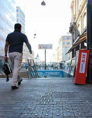
On top of London’s Canary Wharf there is a green landscaped park on the stations roof.  Norreport Station in Copenhagen (right)  is stretched along multiple city blocks creating an extended pedestrian-oriented space. Stockholm’s Odenplan is a station which offers a triangular shaped island filled with urban furniture between busy city street.

Although each station has its own take on placemaking, they each had the open space directly above the underground station to accommodate these strategies. Although it seems so obvious, not many of our North American cities offer a public space at the transit stations. A place where you can pause, grab a coffee and just enjoy and observe your surroundings.
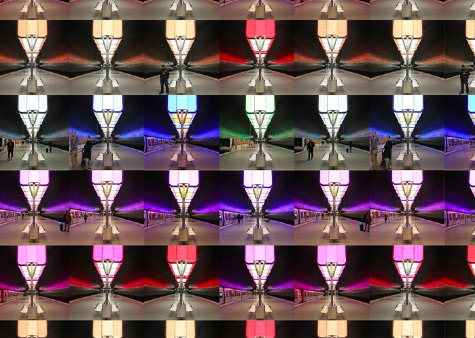
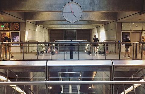
Transit stations are arguably the most public spaces within a city. These stations were designed and programmed to accommodate both the passive and active users going through.

—Mahsa Shobbar, 2018 Iris Prize Recipient

Wayfinding

So how do you know where you are? More importantly, how do you know where you’re going? It can be confusing at the best of times, especially when you’ve arrived at an unfamiliar place. It’s even more confusing when that space is underground. To solve the problem, Copenhagen has adopted standardized designs for its underground stations. Each one is similar in design and signage creating a sense of familiarity for users. As an added benefit, maintenance and operating costs are lower.

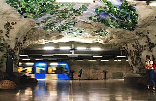
Stockholm has taken an opposite approach. Each station is unique, so users immediately know where they are in relation to the city above, but as well, immediately recognize the where to get off of the train upon arrival.

Wayfinding is especially important when you arrive to a station being visually impaired, require a wheelchair or come with a stroller. Most stations they visited had easy to find, tactile paving, guiding the public transit users to the stations entrance, ticket machine, ticket reader, all the way to the platform level and vice versa. Wayfinding for universal access is most successful when integrated early in the design process and not as an afterthought.

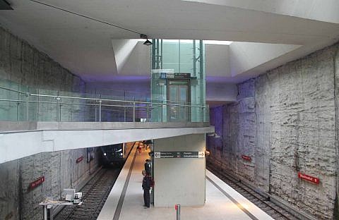
A good example is the Westfriedhof Station in Munich, where the elevator is located on the platform center and celebrated by natural light flooding the space from above.

In many stations in North America, universal access is not integrated into the design. Most elevators are in dark corners and often there are multiple elevators required to move between street level and platform level.

—Sabrina Hoeck, 2018 Iris Prize Recipient

Lighting

The team’s research about the passenger experience and successful design strategies for underground stations highlights how important Lighting is. Especially, regarding how natural versus artificial lighting is used.

Lighting is not only a strategy used for the passengers to be able to activate their sense of sight, but to create a sense of safety and wellbeing. And, in well-designed spaces, as a wayfinding cue. There are two ways to illuminate the underground; artificial, or natural lighting brought in from above.

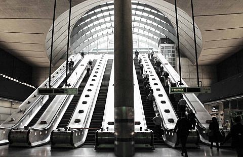
The Canary Wharf station in London is a great example for natural lighting. The glass domes rising up from below the surface, allow natural light to poor all the way to the station level.

Canary Wharf station in London brings it in from above. Massive, sculpted skylights at the escalators create an open, almost awe-inspiring experience in the spaces below. “When you enter the station it almost feels like a religious experience.”

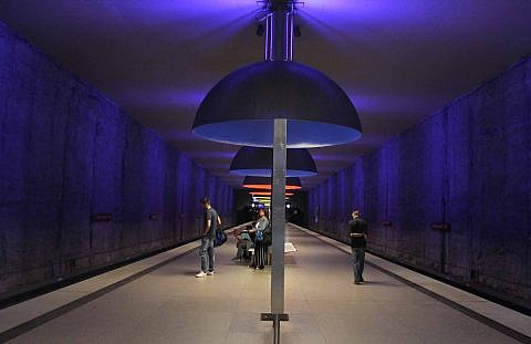
More secular, but no less spectacular, are the fixtures at Westfriedhof Station in Munich. Rather than bathing the spaces in light, they celebrate the darkness and shadows.

Artificial or natural, the underground stations of Europe use lighting to create a unique atmosphere for users, painting with light to each develop a unique identity.

Mahsa and Sabrina’s travels have had an enlightened experience of what underground spaces can be. Now, when we think of underground public transit stations, we think of possibilities for a decorative, exciting and inviting places to design. A “Wonder World” of mass transit that exists beyond the surface of the earth to be enjoyed.  Through the different strategies of placemaking, wayfinding and lighting discovered in the multiple cities explored in their journey, they hope to extract the most applicable ones to not only satisfy but exceed the needs of the existing and future of the North American underground conditions. With this enlightened new lens, they hope to effectively change the way in which underground design is perceived by all decision makers and to elevate the way in which they practice in their careers.